Heads Up Display
I've always been interested in augmenting my senses, especially with a goal of learning faster and better, and managing information better. One of my mental models has been to place these wearable devices on two axes; the persistence of the display, and the information rate of the display. Most modern devices seem to focus on low persistence, high information rate; that is, you only use the screen occasionally, but when in use, you see a lot of information, fast. Computers and smartphones both fall in that category for me, as do most smartwatches (possibly excepting my Pebble, but not for long :( ). However, on a day-to-day basis we use a lot of low-content, high-persistence (or high-visibility) displays. Consider traffic lights, or speedometers. Both these devices provide you near-persistent slow trickles of information that complement your core activity (driving), rather than creating new activities (like using a smartphone). I've been trying to build devices to fill that nice for a long time.
My first attempts, which I sadly don't have any picture of, focused on the skin. I mean, you don't really use it on a day-to-day basis. Inspired by the Northpaw, an anklet that always vibrates to the north, I tried building a watch that worked on vibration. It didn't really work. Too bulky, and too hard to distinguish times with enough resolution. I still think the skin is an underutilized input channel, but for now I've moved on to vision.
First try: the googley-eye
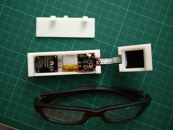
So named because I was working on it while the google glass was still kinda in people's minds, the idea here was to explicitly trade off that persistence/bandwidth dichotomy I mentioned earlier. Unlike the google glass, which sits translucent and unobtrusive when not in use, and can display rich, full-color moving information when it needs to, the googley eye featured a 5X7 pinhole display of LEDs, using parts from Seeed Studio's Xadow line and a 3D printed case. They were pretty fun to work with, and perfect for this form factor. The LED display would slowly scroll text pushed from my phone. In this way, I would have a constant, slow stream of text available. Below, you can see the electronics cover open, and the pinholes for the led grid.
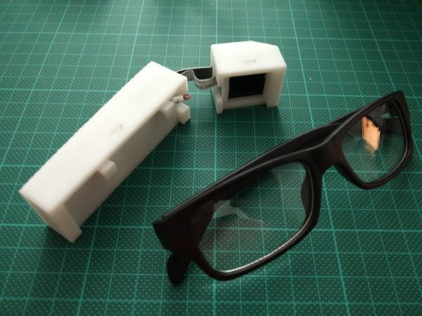
The assembled device, shown below, was pretty bulky.
What really kept me from using it, however, was the precision necessary for the pinholes. I wanted to use pinholes to focus the LEDs, as otherwise they would blur into an unreadable mess. I tried using our laser cutter to punch the holes, but that was nowhere near a small enough diameter. After finally sitting down and doing the math, there wasn't any clear way to make sufficiently small pinholes with the equipment I had at lab, and the project languished.
Second try: the Vufine+
I was pretty excited in early December when I saw a Kickstarter for the Vufine+. The device promised was a 720p HDMI display that attaches to a pair of glasses. While it wasn't as fundamentally low-bandwidth as the googley-eye, I could roll my own software to display whatever I wanted.
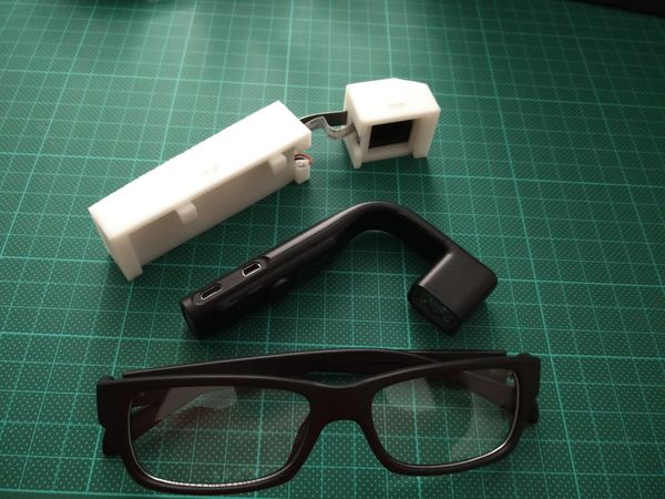
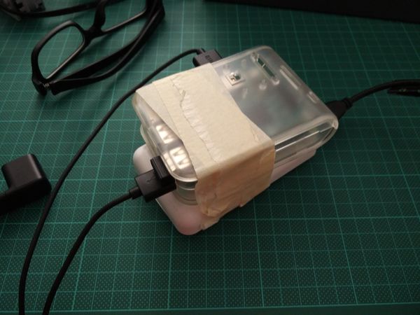
The device came in just a few weeks later, which I was really impressed with. As the device itself was just a display with a battery, I needed a computer to attach to it. I had a spare RPi3 from my old Halloween party lights project (which I'll hopefully write up some day), so the obvious move was to create a "mobile" computing setup by taping it to an external powerpack, plugging in a wireless keyboard and keeping the whole setup in my backpack.
But what to display? I had just watched the great google tech talk on Learning to Learn by Barbara Oakley, where she mentions flash cards and pomodoro timers as two proven techniques for learning. So, I decided to create a simple web app using Flask and Javascript to display a pomodoro timer on the left, and cycling Mandaring flashcards on the right. I chose this layout because with my glasses frames, the Vufine sits slightly to the right, so the left side of the view is slightly cut off. Below, you can see the system in action.
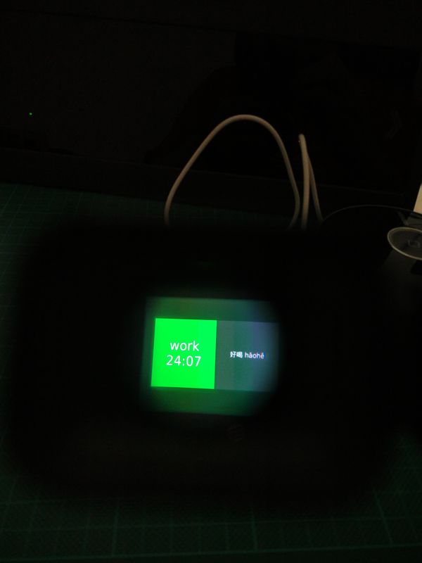
You can see the code on my github. Right now it's pretty shitty. I was trying to make the system some weird modular thing to have other display components in the future, but really its just messy. I think the next version will use iframes instead, and hopefully the grid layout, if that's supported. I've been using the thing at work for about a week now, and I think its useful. The pomodoro timer being constantly visible helps, though I'm often interrupted while working, and the flashcards have helped me remember some words, though way less efficiently than just sitting down and focusing on them.